4 tips for analyzing your landing page conversions with GA4

In Google Analytics 4, a landing page is defined as the first page a user lands on, which can be your homepage, product pages, lead forms, blog posts, or any other page. It could even be the checkout page if the user’s session timed out before they completed their purchase.
This is a bit different from the common understanding of a landing page, which is usually the page that a user comes to from a specific campaign or channel. This might be a dedicated landing page, but it is often the homepage or a product page.
Whichever way you define them, landing pages are important because as the first touchpoint with a potential customer (either overall or within a session), they set the tone for everything that happens next. For instance, if a page doesn’t look relevant to the user they will bounce right away.
Now if you’re also spending money to get those users to your landing pages and these pages don’t convert well, that’s bad news for your bottom line!
This is where Conversion Rate Optimizers can step in to help understand what’s missing and improve the conversion performance of your landing pages. One of the tools that help us in these efforts is the widely used Google Analytics 4.
In this article we’ll cover 4 different ways you can make use of GA4 to understand your landing page performance better:
Analyzing the conversions
The power of filters
Traffic sources and
The comparison tool
1. Analyzing your current landing page conversions
First things first, you can view the number of users who landed on the page but it would be far more interesting to see which pages have better conversion rates and what types of conversions they contribute to. So head to the landing pages report to see all conversions.
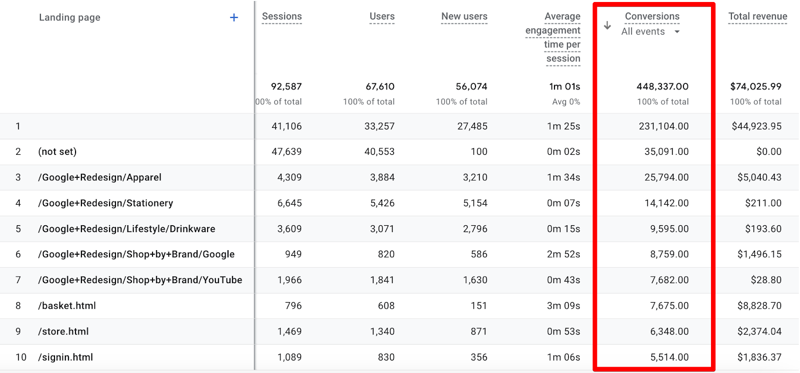
By default, this report will show you all conversion events mixed together. To get more focused, click on the All events drop-down and select the specific conversion event that you care about most.
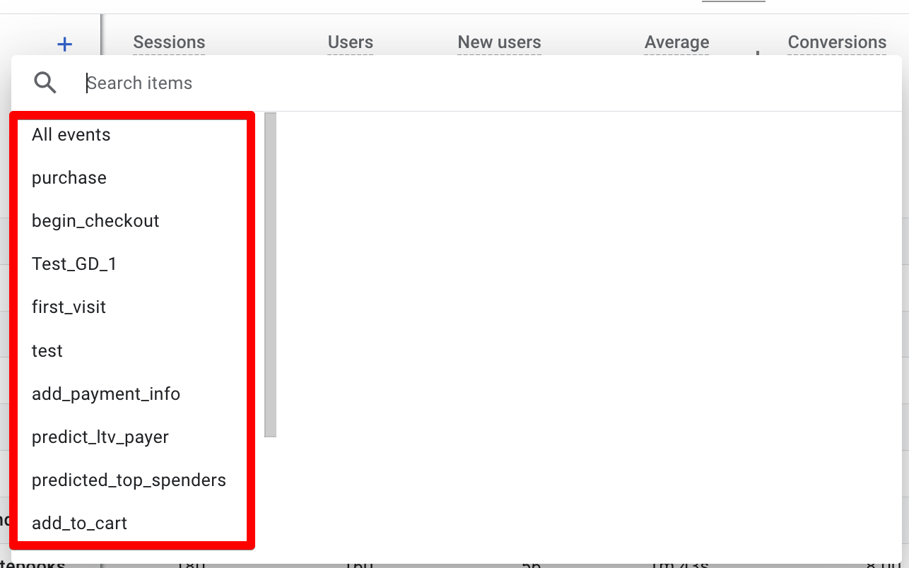
From the above list of conversion events purchase seems to be the most important for an ecom store. In this case, we’re looking at the analytics account for Google’s Merchandise Store.
Selecting the purchase event will change the top landing pages:
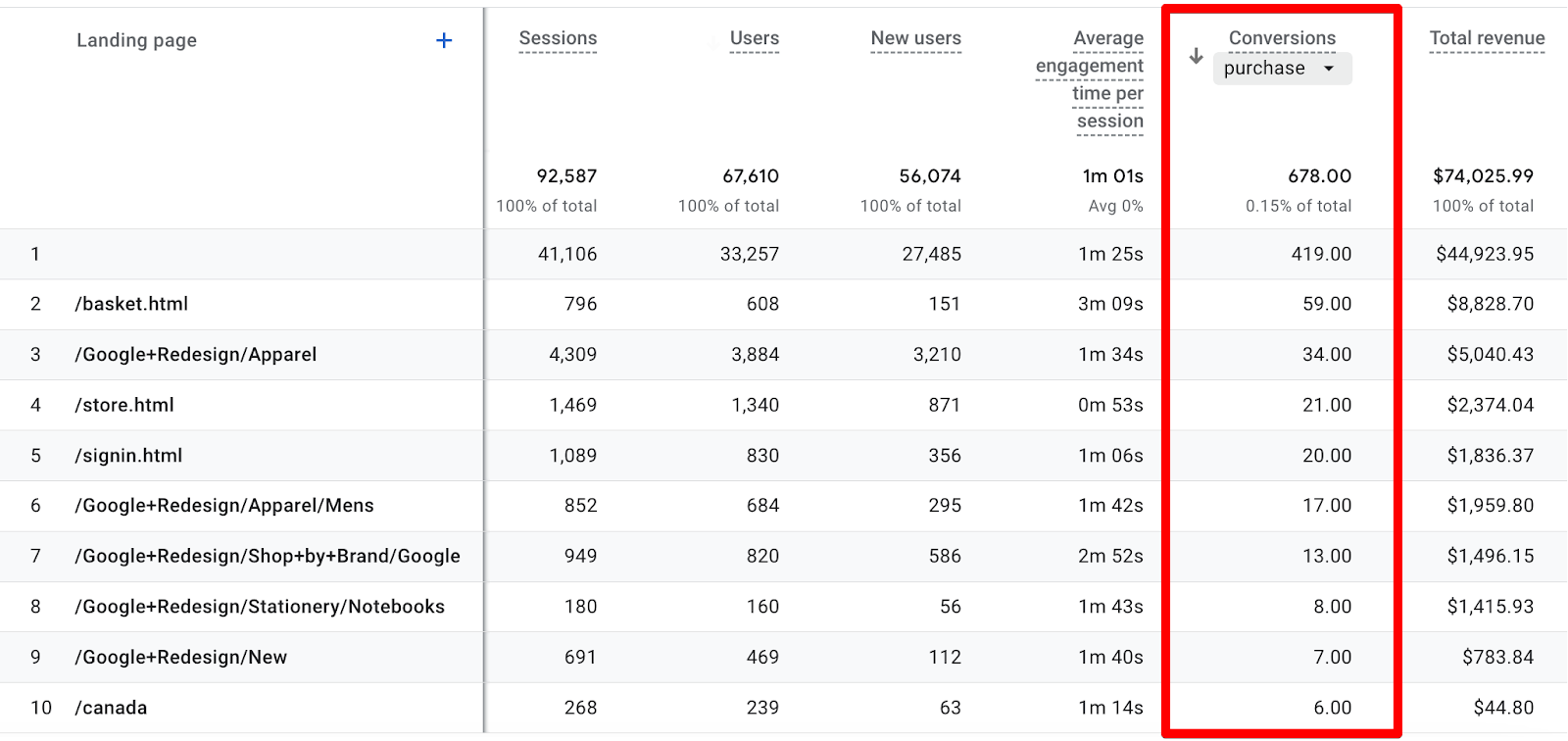
As you can see, some of these pages have just a handful of conversions flowing through them. There's not much point in doing an analysis when the total number of conversions is so low.
Ideally, we'd be looking at rows with at least 100 conversions, so we can expand the date range from the last 28 days to the last 12 months to get more data:
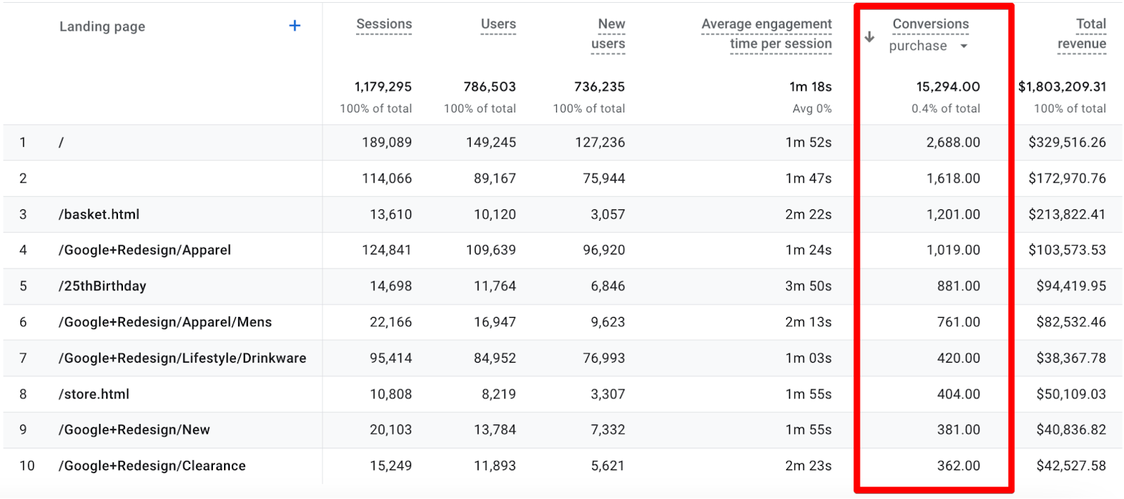
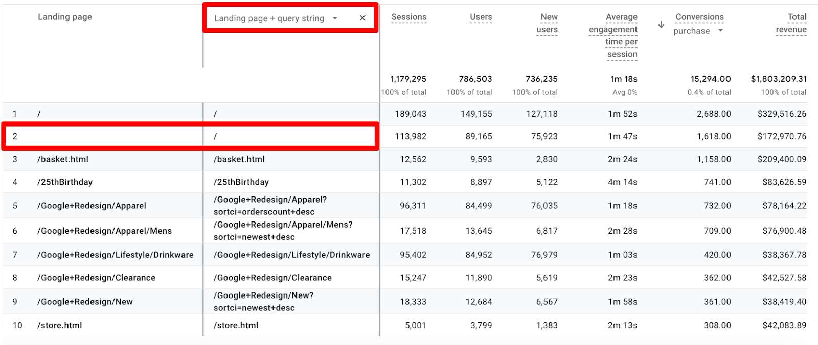
Now we can quickly see that the homepage is bringing quite a lot of purchases. The blank Landing page value in the second row is just some bug which is generally your homepage but you can quickly verify that by adding a secondary dimension of the Landing page + query string.
This means in total, the homepage brought in 4,306 conversions but this absolute number of conversions does not paint a full picture of what we need - we want conversion rates.
Here’s how we calculate the conversion rate (aka CR) for the homepage:
4306 (conversions) / 303155 (sessions) * 100 = 1.42%
But is 1.42% a good CR? Really there is no such thing as a “good” or “bad” conversion rate in an absolute sense, it only makes sense to compare one CR to another related one.
Since we are talking about a landing page, it would be helpful to compare it with other landing pages - which we can look at in the next section when we learn about using filters.
This manual calculation is pretty tedious, but thankfully there’s a Session conversion rate metric that we can add to our reports as long as we have the edit permissions. Here’s how:
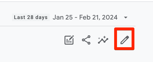
1. Click on the pencil icon in the top right corner.
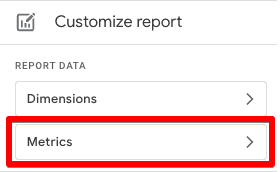
2. Click on Metrics under the Customize report section on the right side
3. In the ‘Add metric’ field search for ‘conversion’ and you will see the available metrics.
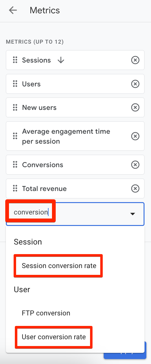
4. Click on Apply and Save → Save changes to current report.
Session-based conversion rate would make more sense if you are looking at the landing pages’ performance since the landing page is tied to a session, but generally in CRO, the user-based conversion rate is what we’re after. The FTP aka First Time Purchaser conversion rate is interesting to know the percentage of active users who made their first purchase. This metric is returned as a proportion, for example, 0.072 means 7.2% of active users were first-time purchasers. You can also edit the report to add other metrics like engagement rate, bounce rate, etc. to better analyze the performance of your landing pages, but to do any of that you need edit permissions in the account.
2. Using Filters
Using filters will help you to consolidate and further drill into the type of pages that bring in conversions and then you can group them to see their performance based on their conversion rate.
So, let’s try to filter it by the ‘apparel’ in the example below.
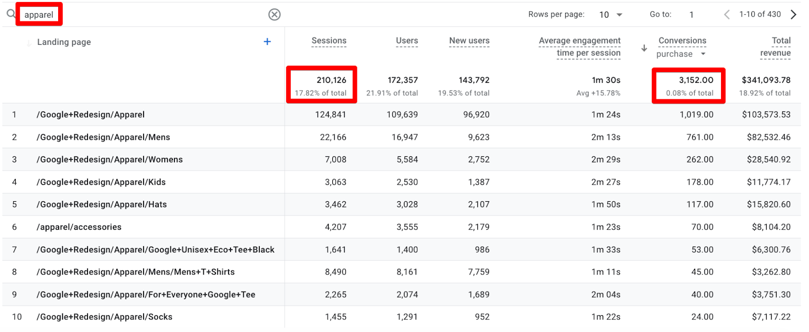
Now, on the surface, it looks like the homepage is doing much better with its 4,306 conversions vs 3,152 conversions brought by apparel pages.
But when we look at the conversion rates things change:
Homepage = 4306 / 303155 * 100 = 1.42%
Apparel = 3152 / 210126 *100 = 1.50%
So actually the sessions that land on an apparel page convert at a higher rate than the ones that land on the homepage.
At this point, you’re probably wondering why we’re calculating these CRs manually again, and I don’t blame you. After all, we just showed you how to add the conversion rate to the report, so what gives?
Well, the answer to that is in the little caveat “as long as we have the edit permissions”. Since we’re looking at the Google Merchandise Store, we’re not able to edit these reports.
3. Traffic Sources
How are traffic sources relevant to an article about optimizing landing pages? Koalatative's Co-Founder Ryan Thomas explains:
“Looking at metrics for landing pages is just barely scratching the surface, to go deeper we need to look at the traffic sources that are sending people to those landing pages. Looking at how different landing pages perform for the same traffic source, or looking at the same landing page for different traffic sources gives you a more concrete comparison that you can start to derive insights from.
Visitors may have very different awareness or intent levels depending on the platform that they came from. For example organic social will typically drive more top-of funnel traffic with lower intent, and at the opposite end of the spectrum, people coming from your email campaigns have already been to your site, subscribed to your list, and probably received a few emails already, so they are already familiar with your website, your offering, and your brand. These visitors will likely have much higher intent once they click through from the email to the landing page.
And similarly, visitors coming from the same source to different pages will have much different experiences. If you’ve even clicked on an ad for a specific product and then been dumped on the homepage, left on your own to figure out how to find that product that piqued your interest, you’ll understand this.”
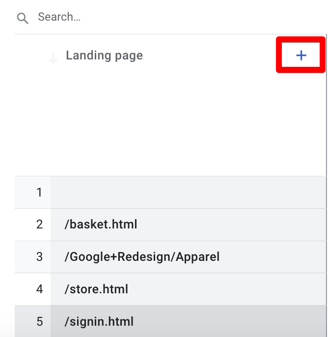
The first step in figuring out how to optimize the user’s experience of landing on your site is to analyze the conversion performance of traffic source and landing page combinations, which you can do by adding a secondary dimension to the landing page report.
First, click on the ‘+’ icon next to the Landing page dimension.
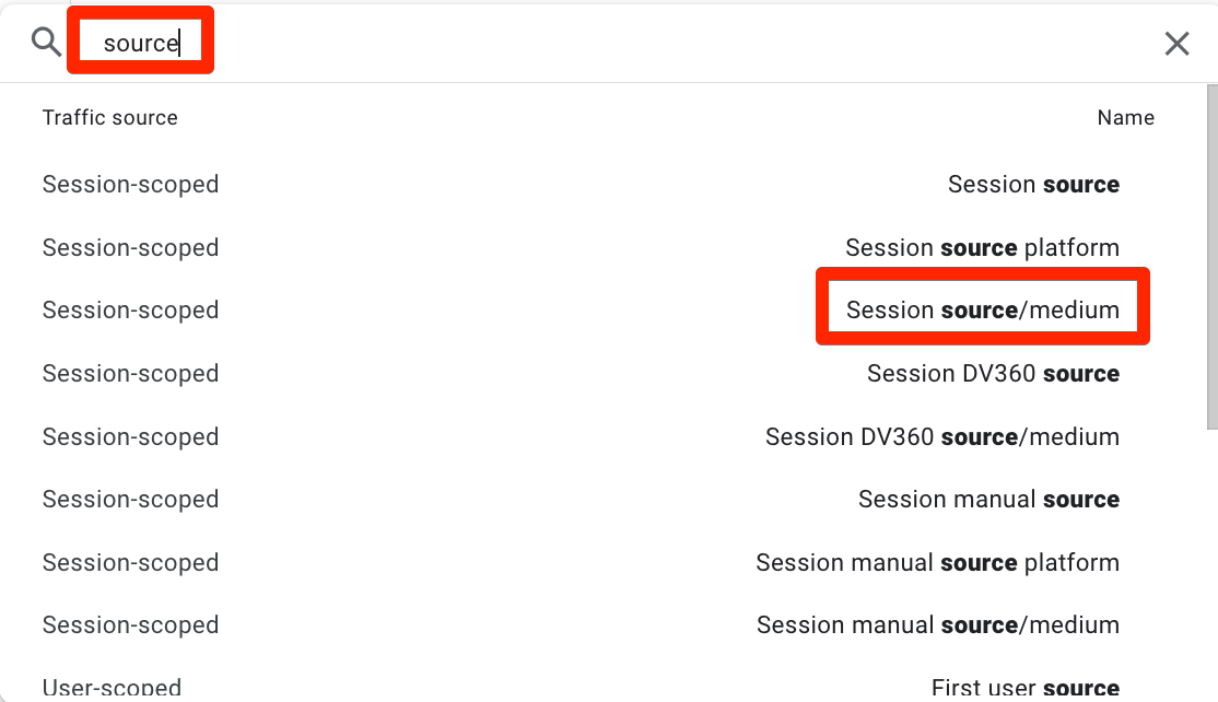
Now search with ‘source’ and you will see several options. We will select the Session source/medium as we are not interested in seeing just the first user source/medium.
The reason is that the landing page is tied to the session, so if you want to evaluate its performance you should look at the traffic source for the sessions that started with that particular landing page.
This might match the first user source/medium if this was the user's first session, otherwise, it will show the source/medium of visits prior to this one, where they may have landed on other pages.
Now we can see the traffic sources for these landing pages.
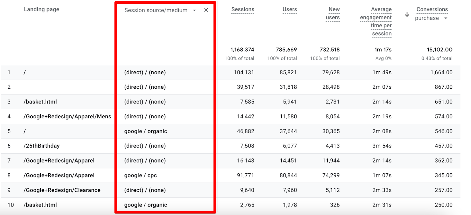
Remember that the empty dimension is also the homepage as we discussed in the Analyzing Conversions section above, so we have to take that into account.
Here we are looking at the combination of every landing page and every traffic source, so this is naturally too fragmented.
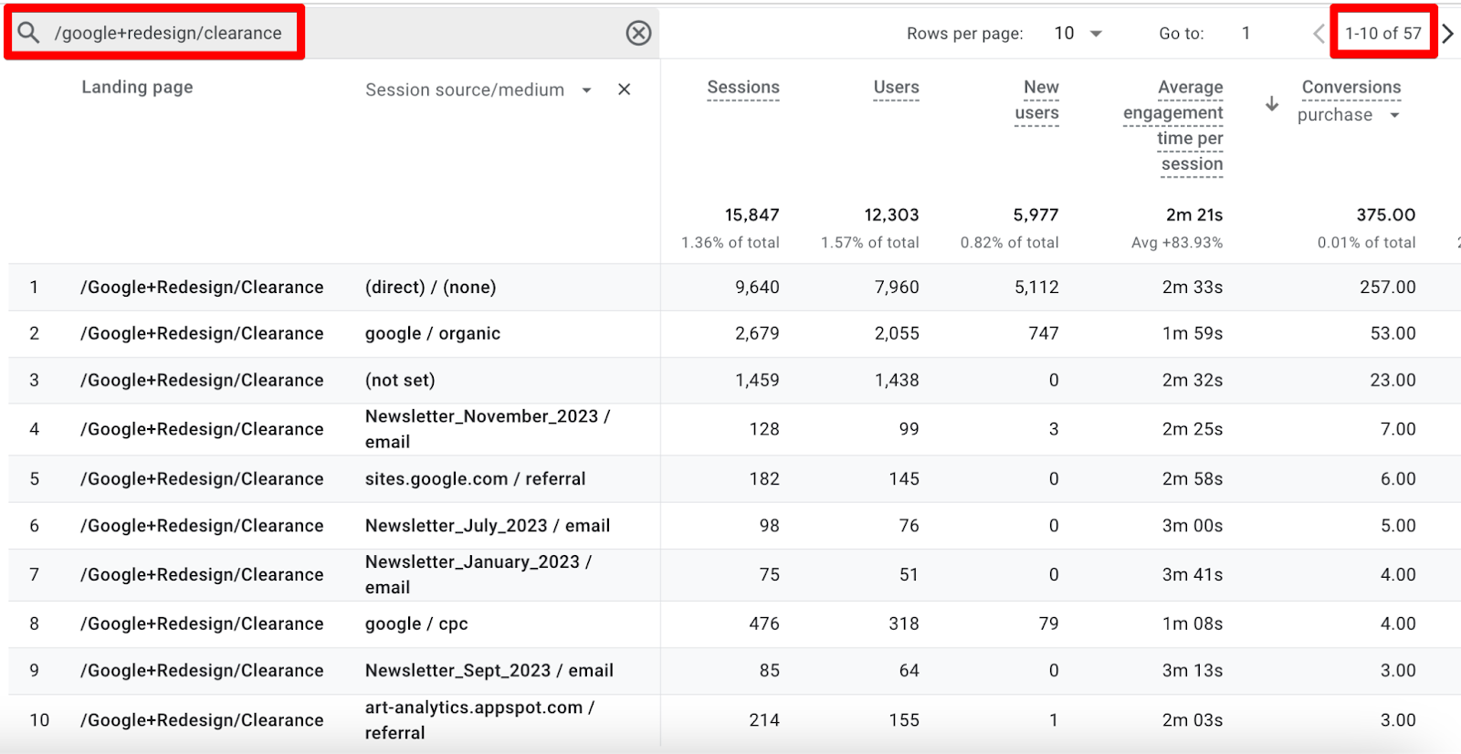
We can use the table filter to narrow it down to one type of landing page and look at the conversion rate for different sources.
It’s important to note that the filter is case insensitive and only works with the ‘contains’ match type across both the primary and secondary dimensions, so if there are multiple variations of the page, we’ll see all of them here. For instance /google+redesign/clearance will show all the results.
There’s another issue here since we are using Google Merchandise Store’s GA4 account, we cannot edit the reports to add the metrics like session-conversion rate and we can’t download that in the spreadsheets to do manual calculations.
As we discussed above, it’s quite important to look at the CR vs absolute numbers. So for now, we are looking at another account that already has a session conversion rate added to the report.
We are going to look at the traffic sources for a specific page and understandably, the page is hidden.
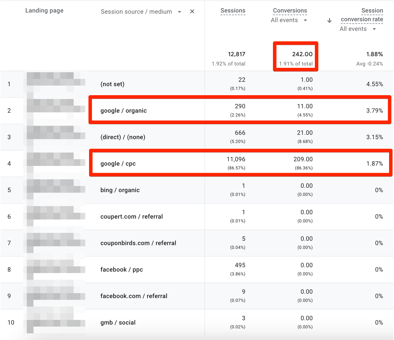
A few things are happening here:
On the surface, it’s pretty clear that google / cpc brings in the highest amount of traffic and conversions but with CR being only 1.87% it means there are optimization opportunities here to convert more sessions.
The facebook / cpc source resulting in almost 500 sessions but 0 conversions shows that more could be done to convert the traffic coming from Facebook.
Google / organic brought in 300 sessions and 11 conversions with a CR of 3.79%. This opens up a discussion to potentially allocate more resources to SEO. It also signals that it would be easier to convert organic traffic vs paid traffic.
This tells us how important it is to have the conversion rate to give us the full context and how it can save us from misdirecting our resources.
Another way to look at the traffic sources is to filter by a single traffic source and see how that traffic performs on different landing pages. Let’s drill it down to google / cpc as it seems to have brought in a lot of conversions for one type of landing page.
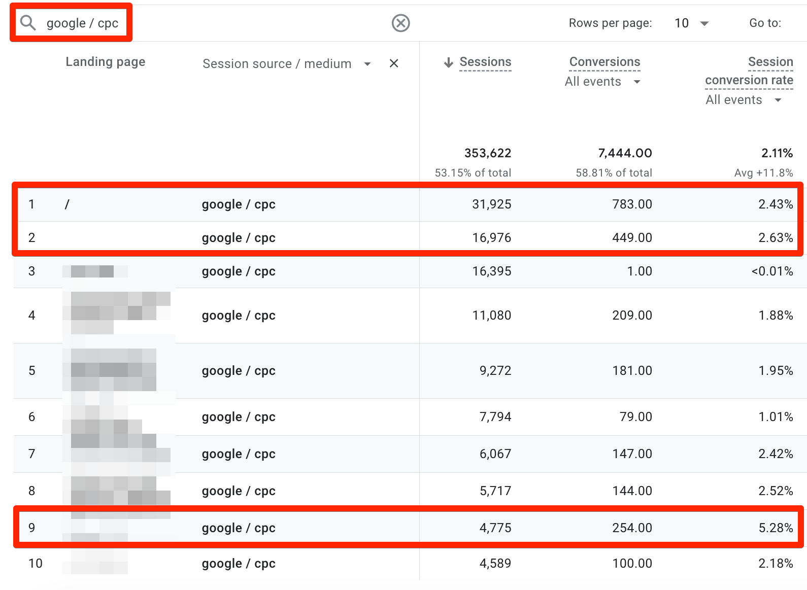
One thing we’d love to do here is to sort by conversion rate and filter by a minimum of 100 conversions (or more depending on the traffic) but thanks to Google the table filter doesn’t let you do that. It is doable in the explorations, but we are only looking at the built-in reports in this post.
So, the first two pages are actually just the homepage and it looks like the average CR is higher than the single landing page we filtered by above.
But the most interesting one is the page in the 9th row with 5.28% conversion rate where the traffic coming from google / cpc is converting quite well!
For one, it means more ad traffic could be directed to this page, but to take it a bit further, the page could be researched to find out what it is doing so well.
How the whole journey looks for the visitors from seeing the ads to landing on the page for them to convert at a higher rate would be a great question to start with.
It’s important to note if the page is for a specific campaign like Black Friday or Cyber Monday because that could be somewhat misleading in a longer-term context.
The key takeaway here is that if we were only looking at the conversions vs conversion rate, we’d just assume that the homepage is performing really well - which isn’t the case. Once again, CR for the win!
Now, if proper e-commerce tracking is in place then using Average revenue per session or user might be another metric that we can use to measure the impact of traffic sources - which is still better than only using the number of conversions.
4. Comparisons
There are two ways you can do comparisons in GA4 reports: comparing periods and comparing dimensions.
1. Compare periods
You might want to see how conversions fare between two different periods. Clicking the date selector on the top right will help you do that where you have multiple options for different date comparisons.
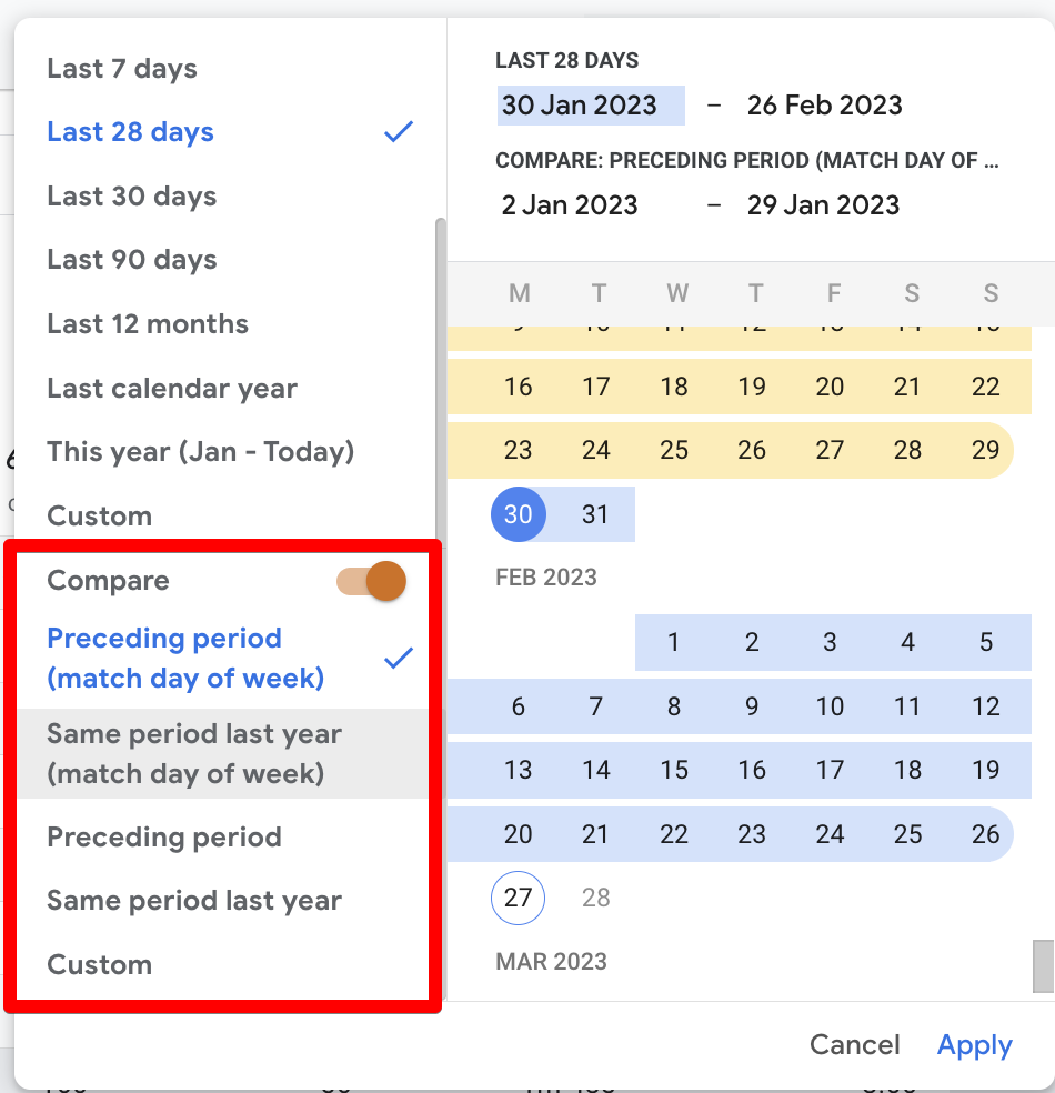
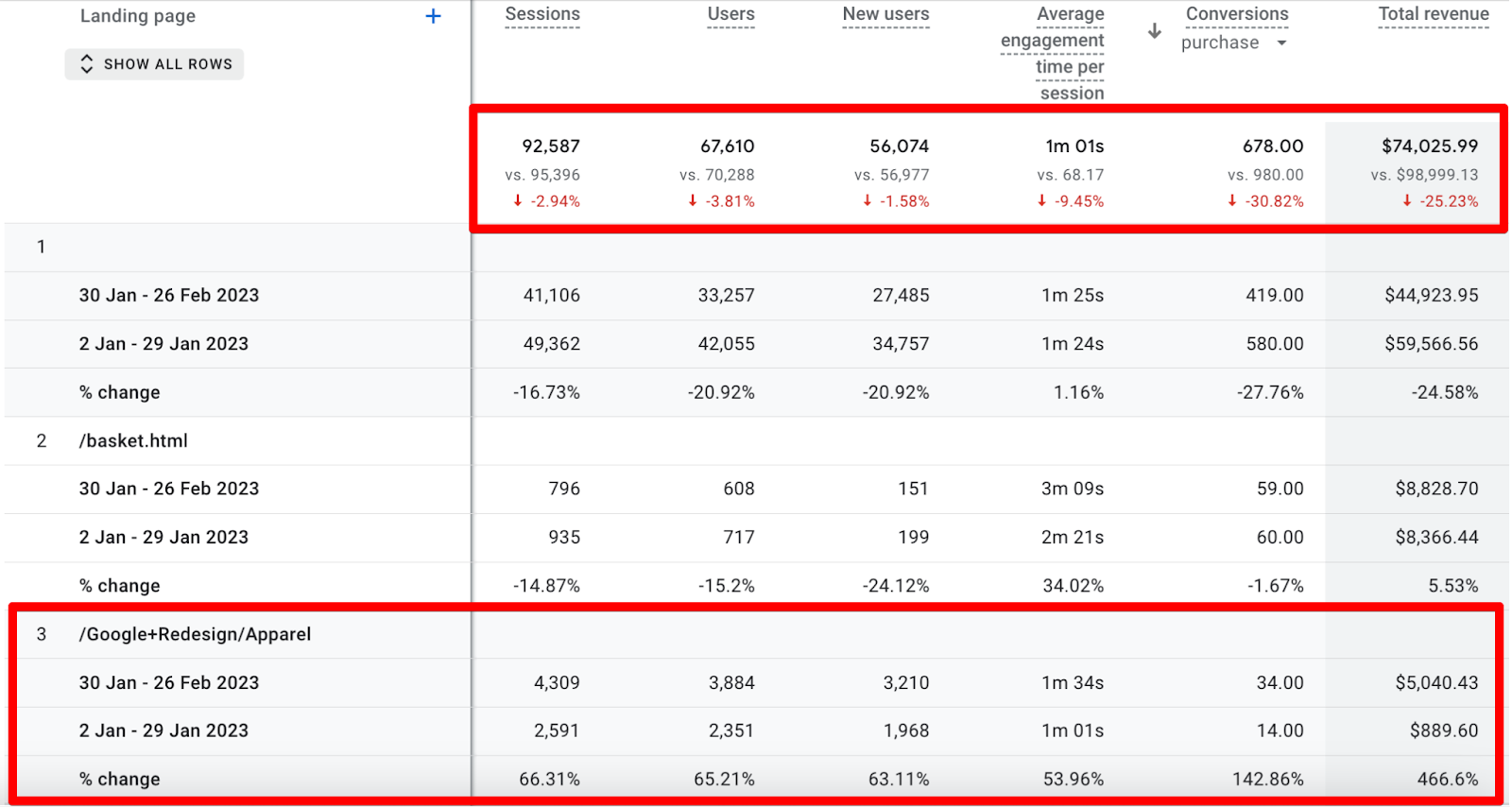
You can now see the comparison of the landing pages in the table below which shows the data for both periods and the % change in the rows and the totals.
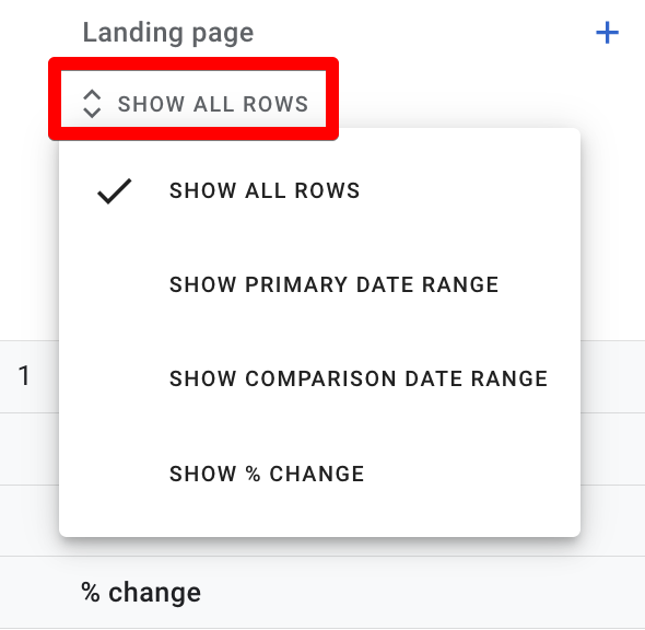
If the amount of rows gets a little overwhelming, then you also have the option to view one type of row at a time. Simply click on the show all rows drop-down menu under the Landing page dimension in the first column.
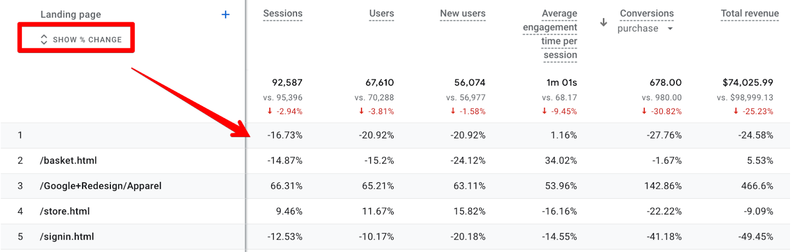
For instance, if you just want to see the % change then you can view that easily as shown below:
What about the graphs? It looks like this when you’re comparing the data for two periods:
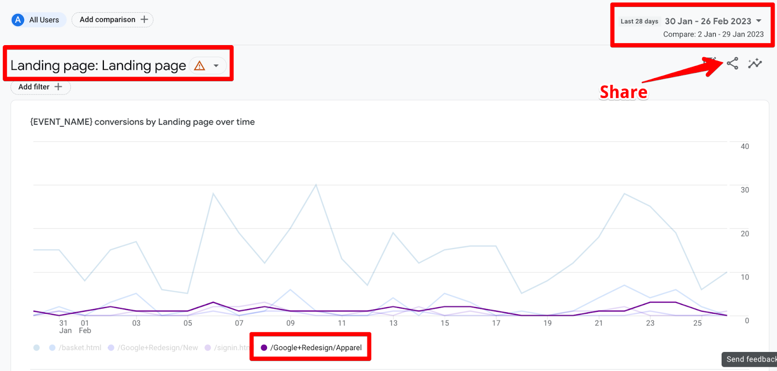
This isn’t very helpful because it doesn’t show both periods and defeats the purpose of seeing a comparison. Let’s add it to the queue of ‘Simple GA4 issues that Google should fix’, hope they get to it someday!
If you want to highlight a specific page or pages in the graph then you can click on the legend and it will highlight those like /Google+Redesign/Apparel in the above screenshot. Click again on the same page’s legend and it will stop highlighting the ones you had clicked on.
If you want to do more with this data then there’s always the option to download and manipulate it in Excel or Sheets (after uploading) by clicking on the share icon on the top right but you need the right permissions to download data.
2. Compare dimensions
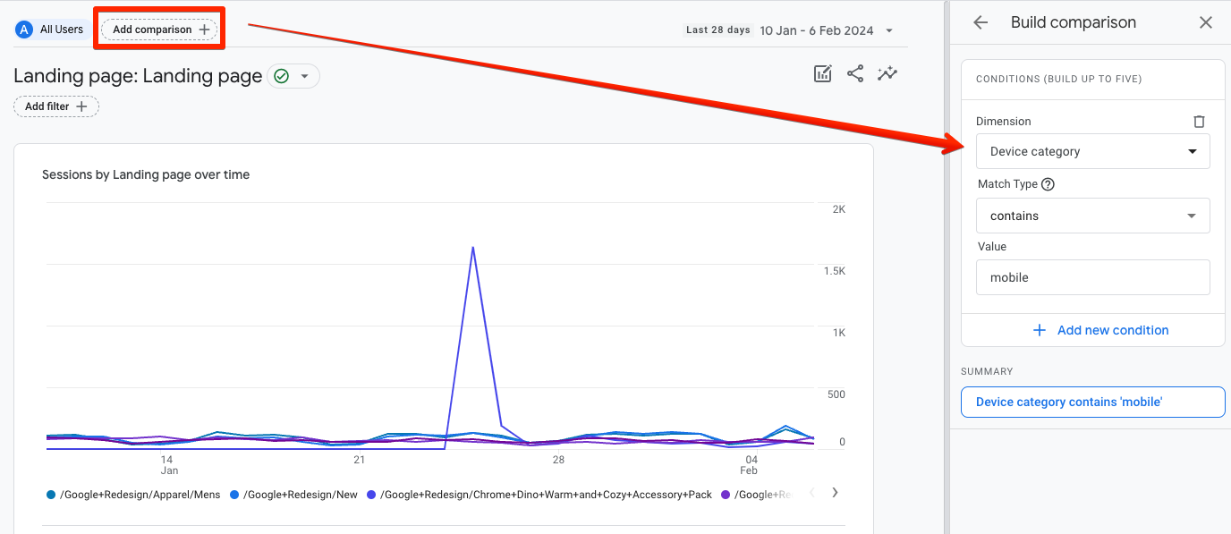
This takes care of the comparison between two periods, but you can also add comparisons for different locations, devices, and well any other dimensions available in the property.
You can do that by clicking on the Add comparison button next to the All Users option.
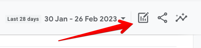
Another way to achieve that is to click on the pencil and chart icon in the top right corner.
You can add five conditions for each specific comparison and have four comparisons in total, which can be for the same dimensions with different values or different dimensions altogether.
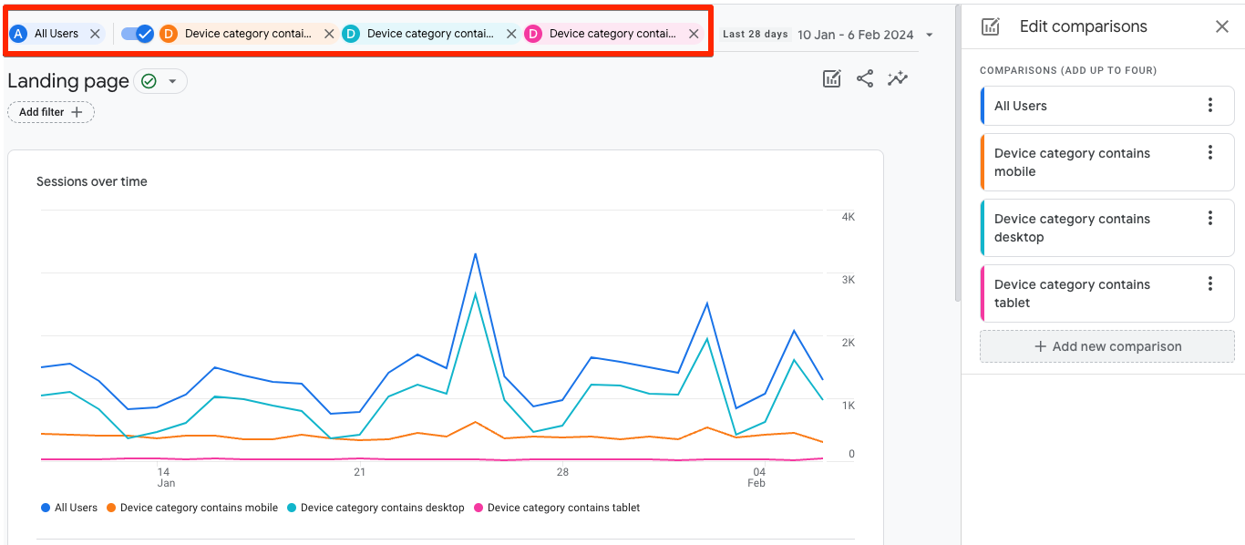
Understandably, all comparisons have their own color to differentiate. The ‘All Users’ comparison option is there by default but you can remove it to add a different fourth comparison by clicking on the x next to it.
The cool thing about these comparisons is that they are “sticky” so if you go to any other report, they will still be present, sort of like mini-segments. You can also toggle them on / off because you might not necessarily want to see them everywhere.
The stickiness of these comparisons might remind you of the segments we had in Universal Analytics but the comparisons are not as robust.
With the UA segments, you could do things like sequential segmentation, selecting the scope of the segment i.e. user and session, creating segments based on specific events, parameters / their values, and even seeing a summary of how many users there will be based on your specified segment before you even create and apply it.
These things are still possible in GA4’s segments (rather than comparisons), but these can only be used in explorations, which are much more powerful than standard reports but come with a much steeper learning curve.
Hopefully, this should clarify what comparisons can do and how segments in explorations can save the day to get more out of your data!
This is when you need to head over to the Explore section because that’s where you can apply the segments to get more context as well as throw in the metrics that are more relevant to you.
Conclusion
Landing pages can truly make or break your campaign strategy. By creating targeted, conversion-focused pages that match the messaging of your campaigns and are designed to prompt specific actions from visitors, you can improve your ROI, increase conversions, and grow your business.
When set up correctly, Google Analytics 4 is a powerful resource that can help you understand and optimize your landing pages for better conversions. Koalatative's Co-Founder Gerda Vogt-Thomas adds:
"We work with so many companies that allocate massive resources to paid ads and SEO and none to landing page optimization. At the end of the day, it doesn’t really matter how much traffic you’re able to drive to your landing page if none of the visitors understand what they’re supposed to do over there. Analyzing what your visitors are doing on the landing pages will definitely help you optimize all your traffic channels and campaigns as well. Even though the switch from Universal to GA4 has made life a bit more complicated for all of us, it’s still one of the easiest ways to get those insights with a relatively low time/cost investment."
To get rich data you should be adding tracking for CTAs, clicks on other important elements, and page scrolls that will help you analyze how your customers are behaving on your landing pages.
If you think the GA4 interface is somewhat buggy or limiting then you can take things to the next level by exporting data to BigQuery for more in-depth analysis.
Don’t forget that quantitative behavioral data is only part of the customer journey optimization puzzle. GA4 data becomes especially powerful when combined with qualitative data sources like heatmaps, session recordings, and surveys because together they paint the full picture of what people are doing on your landing pages and why they’re doing it.
Want to know what we're up to?
We'll send you an email when we publish new content